What is Covidian if not ‘covfefe’, that nonce word which landed with us six minutes after midnight on May 31st, 2017, and never left. The fanfare surrounding Trump’s Twitter neologism (mere gaffe or Straussian sign?) was aberrant only in the retrospective lucidity of its suspicions: something was indeed afoot. Covfefe heralded not a deliberate conspiracy, per se, but the rise of conspiracy as a typographic language drawing both left and right into its paranoiac vortex.
Geoff Manaugh coined ‘typographic paranoia’ on Twitter recently as an outsized preoccupation with bureaucratic texts and textures: watermarks, capital letters, ink stains. The capriolic jump from covfefe’s ‘cov’ to COVID-19 emboldened early enthusiasts, who during November’s election cycle began promulgating graphomania with increasing fervency. On media platforms and message boards, typographic paranoiacs propound nonsense for a world of no sense, seizing on the material amidst sensory dematerialisation. The deliverance of language from all fealty to nuance has seeded distrust in its design, willing words against their wrappings in jabberwockies for the Covidian-inspired.
I want to speculatively interpret recent instances of typographic paranoia through its pre-history in 20th century avant-garde tendencies. Before considering some useful European framing, I’ll begin with the local origins of this current in American typography.
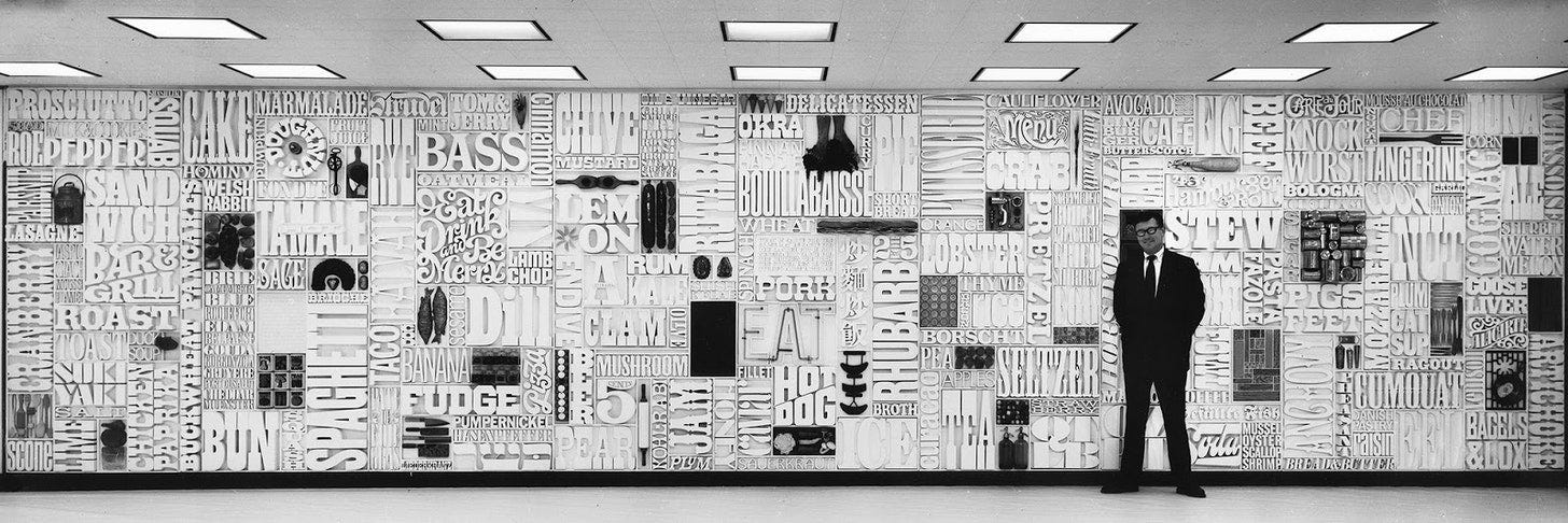
The longue durée of U.S. postwar graphic invention is well-encapsulated in a mid-1960s episode when CBS art director Lou Dorfsman enlisted his friend Herb Lubalin, impresario of the ‘counter-cultural’, often censored EROS and Fact magazines, in creating an installation for the cafeteria in Eero Saarinen and Florence Knoll’s vaunted ‘Black Rock’ headquarters—a Kaaba of commercial broadcasting on 52nd street, in New York City, across from the templar MoMA. Spanning over 35 feet wide and 8 feet tall, Dorfsman and Lubalin’s ‘Gastrotypographicalassemblage’ constellated 1650 hand-milled letters and 65 food objects in a dizzying sculptural relief. The intricate mosaic imputes collectivity or consonance to seemingly random word pairings—‘5/Beer/Pear/Kohlrabi’—while simultaneously stripping them of individual meaning. Dorfsman’s installation approached its ornamental imperative by giving an audience of hungry television workers a taste of their own visual strategies. The tantalising culinary panoply is graphomaniacal in that its verbosity whets the appetite but withholds from fully feeding. Viewers must inhale the many simultaneous offerings by scaling its surface, taking up residence in the interstitial cracks. Though syncopated in compositional rhythm, ‘Gastrotypographicalassemblage’ avoids total fragmentation—outright psychosis—in its Gestalt of palette and subject. It was, after all, made for the creators of a kaleidoscopic and utopian, but ultimately formulaic, TV universe far from our present audio-visual maelstrom. Today, Dorfsman’s wall looks innocuous and unobtrusive in its formal cogency—dare we say, antiseptic.
A few years later, in 1971, the writer and designer Ellen Raskin would model graphomania as game-design with the Lubalin-like typefaces of her children’s book, The Mysterious Disappearance of Leon (I Mean Noel). Here language is again a source of confusion and unrest, but never of alienation. The illustrated forms of Raskin’s characters are composed of thematic lettering, textual cues that accrue value as the plot accelerates. Raskin’s word games anticipate the alliterative and allusive theorising of typographic paranoia, but she is a far more optimistic and ambitious storyteller. For both Raskin and Dorfsman, stimuli must be pieced together towards something sensory, but also sensible, revealing greater truths, a legible world order.
Those 1960s tropes—which at the time, of course, few thought sober—have now soured into typographic conspiracy. This is again a noise language, but nihilistic, senseless, and crucially, anti-machine. Our new graphomania is apotropaic and archaically-minded, and it spreads in textual clustres from the bellies of CBS-spawned news outlets to striated 4-Chan threads through sporadic distension.
One such clustre, from election week: Trump’s spiritual advisor, Florida televangelist Paula White, livestreams a plea for his cause: hearing victory in the heavens, she conjures angels from Africa and South America, rolling out names in rhythmic dashes that recall the Russian Futurist esperanto of the absurd: za-za-zaum. Then, panic and outrage in Maricopa County, AZ over claims that poll monitors are ‘yanking’ pens from voters’ hands and mandating use of Sharpies. Marks ‘bleeding through’ are rumoured to be kept from tabulation by the state’s new machines. Speaking to Laura Ingraham, a Nevada poll worker describes a Biden-Harris van dumping ‘thousands of votes’ outside her station: the only way to know your ‘vote is meaningful, not just made fraudulently’, she says, is by ‘voter-ID’. This poll worker speaks in shadow, her torso silhouetted like a poster for target practice, anonymous but for a wheezing Funkhouser voice and tri-boro lilt. That lilt was perhaps borrowed from ex-Kissinger aide Steve Pieczenik, of New York, who days before tells InfoWars not to worry— Trump has embedded the election’s authentic ballots with ‘QFS blockchain encryption codes’, tracking the voiding of votes in his favour. A self-described ‘lowly peasant in this game’, Pieczenik portends a massive sting operation to be upheld by military and intelligence agencies. Meanwhile, the president lies low, intentionally allowing the election to be stolen, as he has promised since 2012. Ballots not burned are being ‘flipped by machines’. Industry has failed the American people, who must seek help from ancient tools: prayer, Sun Tzu, and even blockchain’s elevated invisible ink.
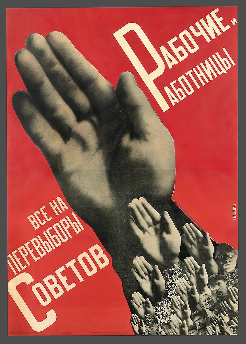
White advocates glossolalia, Arizonans plain pens, the poll worker and Pieczenik a corruption-tracing scheme. All are concerned with the tangibility of the intangible: the presence of angels or non-radioactive isotopes, the blood of a Sharpie. If Sars-Cov2 is too evanescent to be believed, electoral politics provides a welcome contrast as a ritual with textu(r)al authority. For Americans, voting is a votive act, involving material intervention in public life: ballot-signing, button-pressing, envelope-licking. Running your hands over the levers of governance—its rosaries—as Gustav Klutsis propagandised to Soviet masses in 1930. The typographic paranoia now surrounding this supplicative gesture doubles down on the role of touch in imagining community—in knowing one’s oikos, one’s land and family. Mail wars are being waged on several fronts right now (Amazon and electoral) over a kind of oikophobia: fear of home in the face of machinic mutiny. The Trumpian nostos of ‘make America great again’ sought a picaresque reunion with an oikos that the pandemic has at long last upended, after the hydroponic terror of the Bush years proved a false prophecy. In America now, wars are not just brought home, as Martha Rosler showed us in the 1970s, but emerge from the home that is language, law, or country. On your very own turf, your pens have been turned on you, your papers disposed of by shadowy forces—as left and right agree. Typographic paranoia is an oikophobic feeling of homelessness within the home, of extreme sensorial unbelonging. Each oikos war is a battle for control over domestic materialities, for some, fought with hygge and hand-sanitiser; for others, in graphomaniacal whispers. Every version of pandemic politics asks: how plastic is your packaging?
America’s greatest dispatch artist is neither Ray Johnson nor Jeff Bezos, but Karl Rove, whose direct-mail campaigns created an uneasy foundation for today’s materialist (grapho)mania. Fluxus met Fox in the 1980s when Rove began targeting voter groups by examining the curious intersection of syllable symmetry, avocational aesthetics (golf, stamp-collecting), and sociocultural identity, with a strong and seemingly anachronistic emphasis on print media. These were anthrax days, and Rove was an anthrax avant-gardist, a priest of powdered sugar politicking. Like Rove’s direct-mail, typographic paranoia involves narrowcasting to those sweet-tooths already primed to compound ‘cov’ and ‘ID’. It is a special-interest language between Poto and Cabengo, or in practice, Scylla and Charybdis. We have seen earlier post-Roveian iterations in the Sovereign Citizen movement, that 2010s spectre cited by Manaugh for its obsession with administrative aesthetics, from paperwork syntax to tones of military fringe. The SPLC calls their doctrines ‘Byzantine’, but to me, Sovereign Citizens are more Cennini-like: conceiving of the polis as a painted object, they delineate each affective layer of bureaucracy. Typographic paranoia is similarly detail-oriented, but eschews polity for something less Concrete. Rove wielded patterns towards the production of ‘sense’, giving every granularity an oikos, a communal imaginary. The oikophobic typographists bear witness to a revolt by patterns against patternmaking, as if Dorfsman and Lubalin’s neat tessellations rejected their patchworked frame. This Futurism without future is still led by alliterative associations, but in pursuit of nonsense, sounding out what the Russian formalists termed ‘ostranenie’: the de-familiarisation of letter cleaved from language, partisan from public, and in its digital manifestation, medium from materiality.
Speaking of Russia, typographic paranoia also builds on another internet-born idiom: the Suprematism of Matt Drudge. The fast, cheap abstraction of Drudge’s headline reportage assigned type and text degree-zero surface importance, converting politics, smut, and general clickbait into pliable but content-less geometries. Bounding past Drudge’s Suprematism, typographic paranoia has arrived at a crossroads. It must now choose between Futurist-Formalist ostranenic nonsense and Constructivism’s revolutionary potential. Adherents envision in form—paper ballots—and Faktura—watermarking—some material capacity for political instrumentation. They must decide whether Faktura should become factography: will paranoiac typography assume intrinsic storytelling merit, or once again surrender to the dominance of the image—mimetic and ‘cursed’? Will ‘Q’ lead or stay letter only? It is indeed possible to narrativise nonsense, as Goncharova demonstrates in Worldbackwards, and to gamify it, as Raskin did, but whether materiality itself can see victory remains uncertain. An America of typographic paranoiacs, if not of semioticians, will soon go the way of ‘election ink’, that phosphoric thumb-print method of fraud prevention used everywhere power once was: a seal in royal violet.
To its orange grove inaugurator I say, noli me Tangerine. |
Moselle K. (b. New York, turn of the century) studies Memory of Art at the Courtauld Institute in London. She is figuring out what to do with her life so, if you have any suggestions, please write her @birdplay1.
Lou Dorfsman standing in front of his CBS wall, ca. 1966.
The United States of Word Salad: Ellen Raskin’s The Mysterious Disappearance of Leon (I Mean Noel).
Gustav Klutsis, Worker Men and Women: Everyone Vote in the Soviet Elections (Raboche i rabotnitsy: vse na perevybory sovetov), lithograph, 1930.


wtf does this mean